Peers
A campus marketing campaign for Peers.net — an online peer support network designed to help college students find community and connection.
Peers.net is a peer-to-peer support platform built for college students navigating the challenges of campus life. The brief called for a suite of promotional materials — posters, a t-shirt, and a tote bag — that could be deployed at college fairs and events. The design challenge was creating something that felt warm, approachable, and human without leaning into the clinical aesthetic common to mental health brands. Everything needed to feel like it belonged in a college student's world.
Moodboard
Before any design decisions were made, a moodboard was developed to establish the visual direction — warm, approachable, and distinctly college-coded. The references leaned into community, optimism, and the kind of casual energy that feels native to campus life rather than institutional.
Brand colors
The color palette was provided as part of the existing Peers.net brand identity. The combination of warm and cool tones creates a balance between energy and calm — approachable enough for a college audience without feeling overly corporate or sterile.
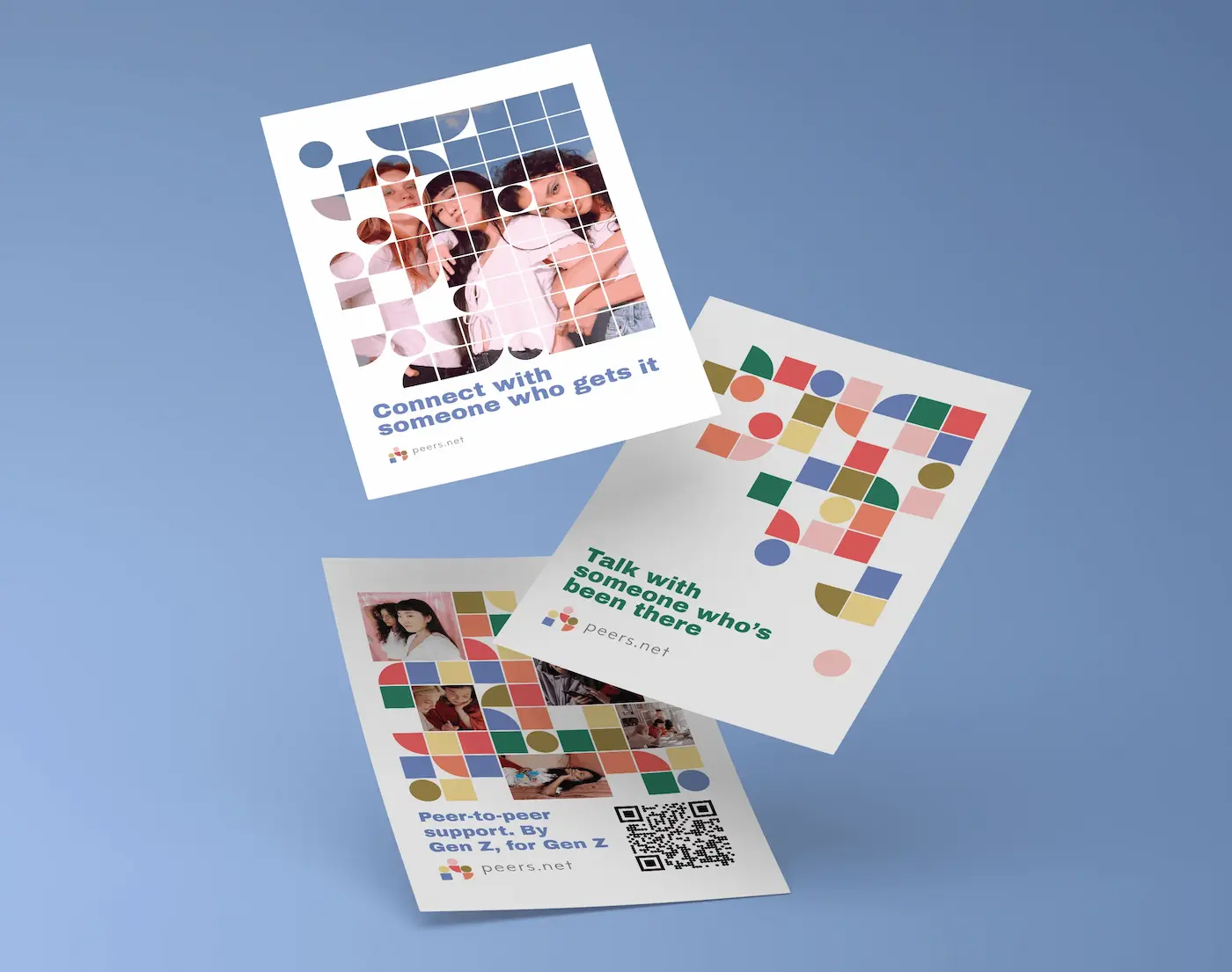
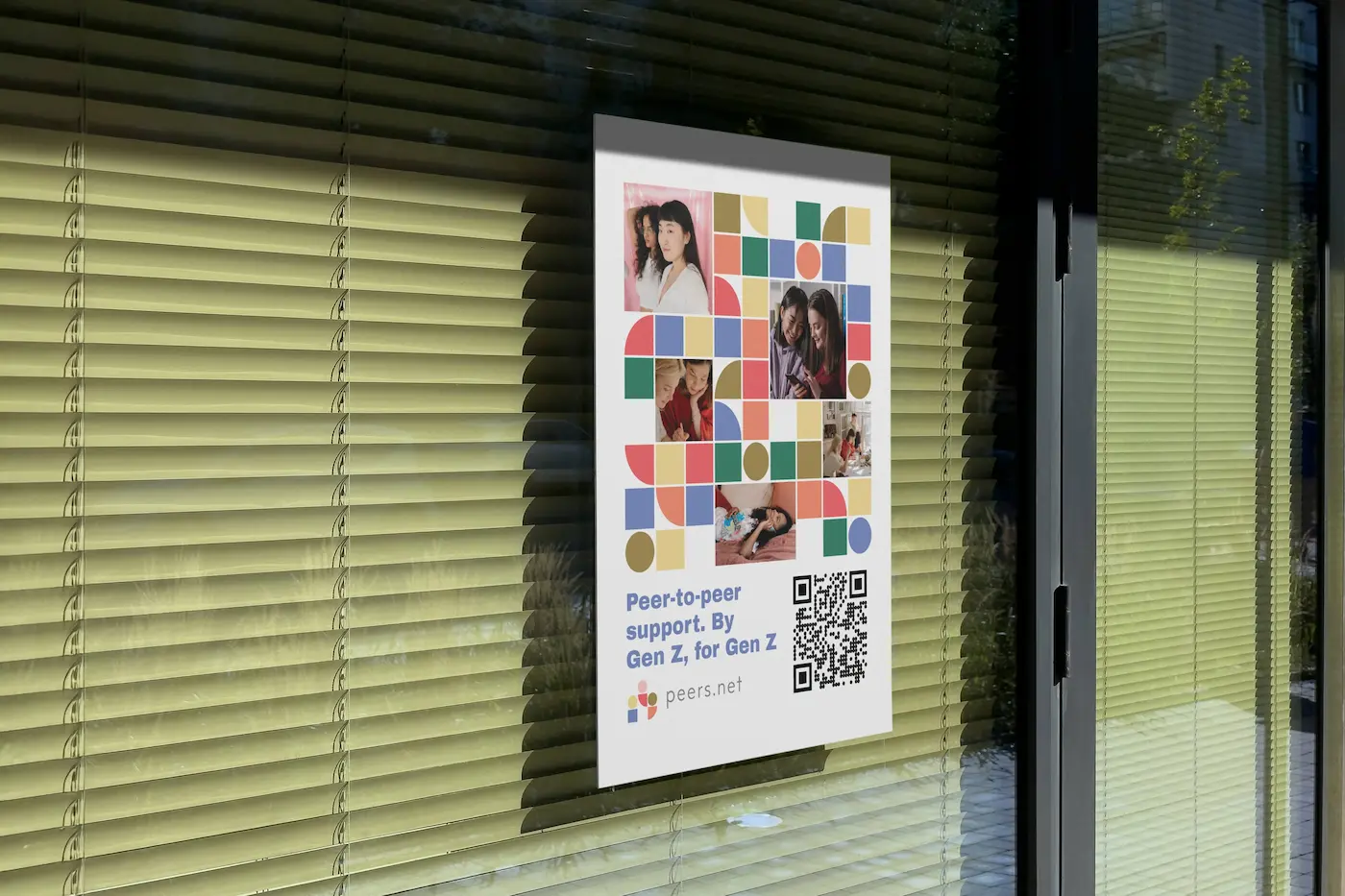
Posters
The poster set was designed to work at two scales — a large format event poster and a smaller flyer version with a QR code for quick digital access. Both use the existing Peers.net brand colors and typography to maintain consistency with the platform's visual identity.
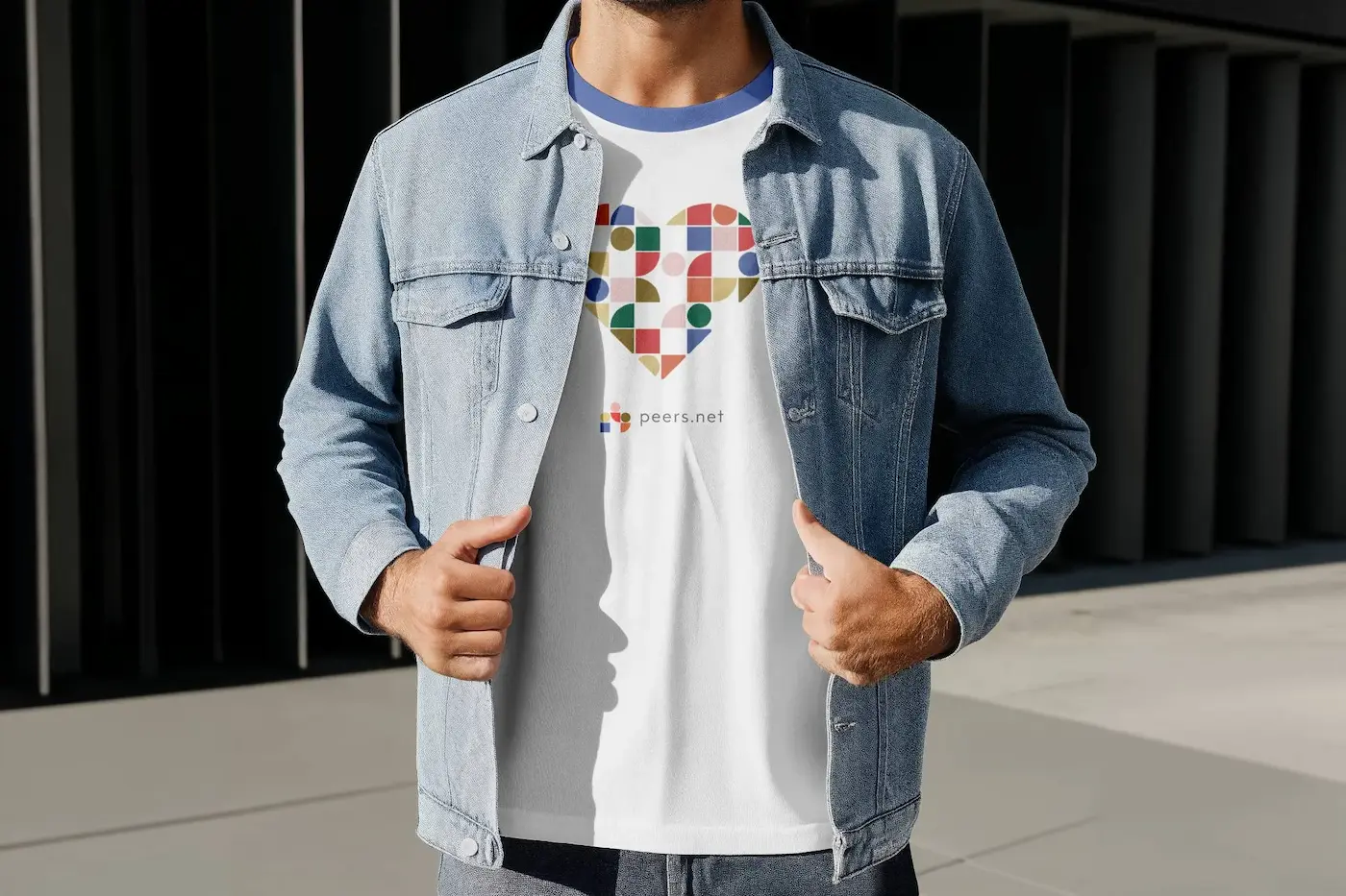
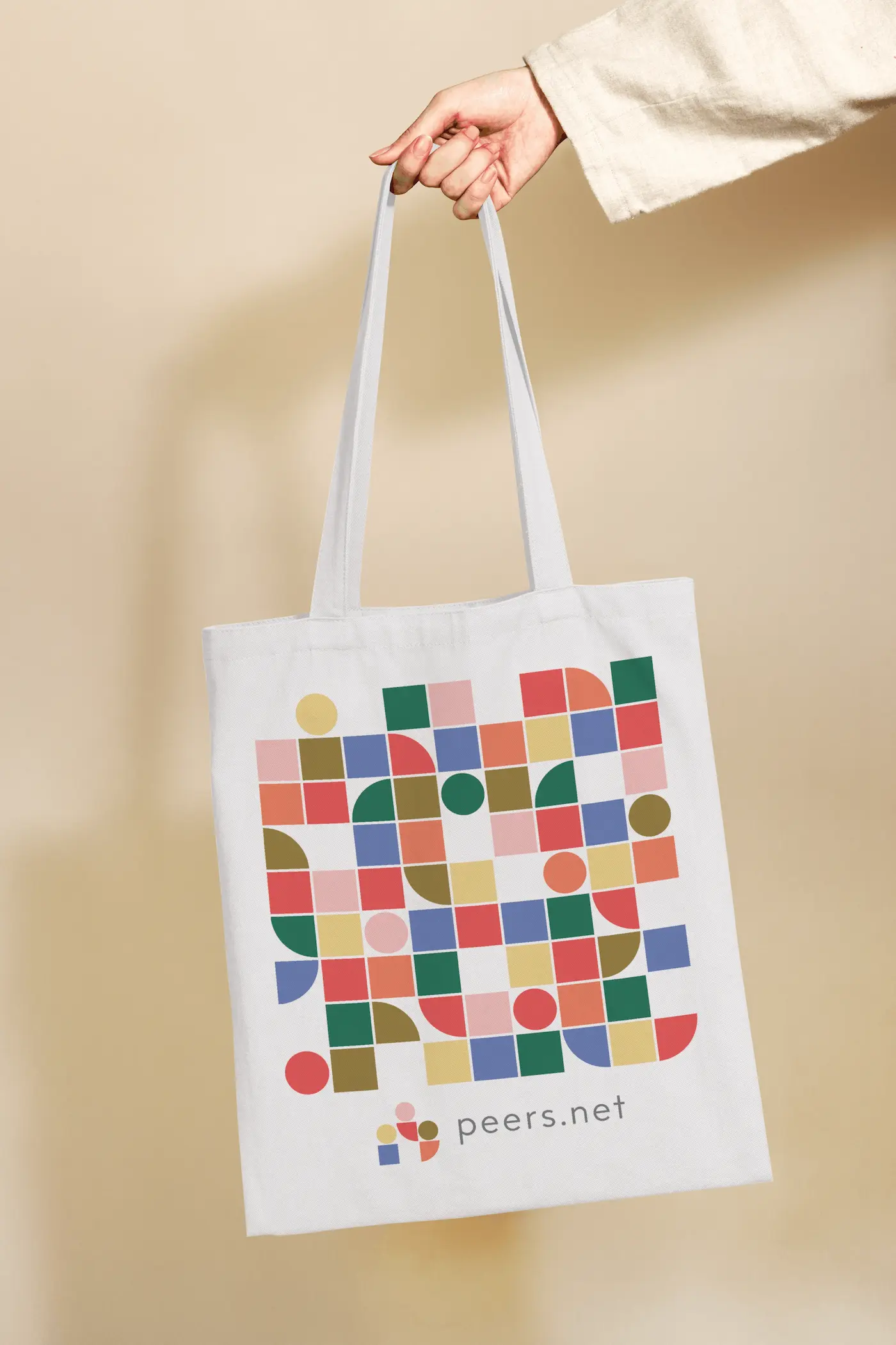
Merch & Swag
The shirt and tote bag were chosen deliberately — both are items students actually use and carry around campus, turning every wearer into a walking ambassador for the platform. The designs are intentionally understated so they feel wearable rather than promotional.