Humm Kombucha
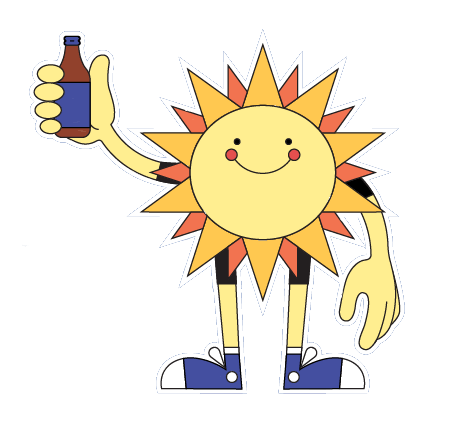
A playful packaging redesign for Humm kombucha, built around a retro sun mascot and a bold flavor-forward color system.
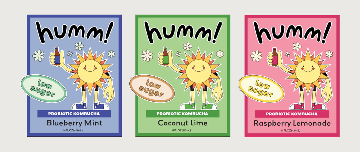
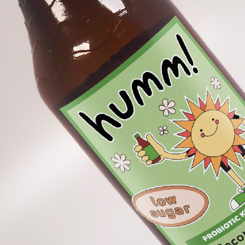
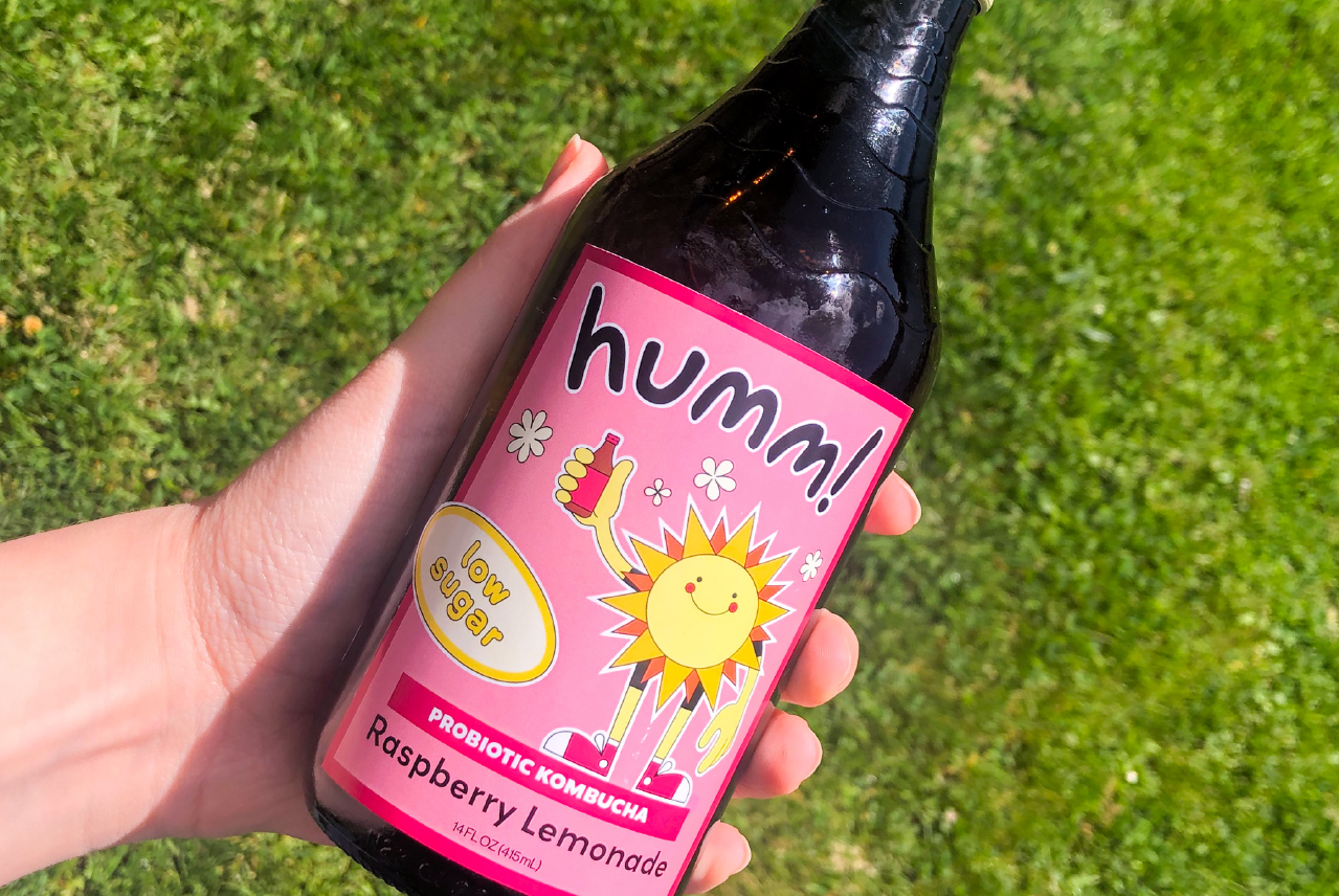
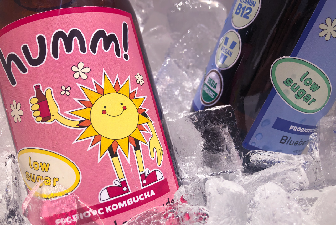
Humm is an organic, kombucha brand based in Bend, Oregon. The brief called for a full packaging redesign that retained the brand's friendly, approachable personality while giving it a bolder, more visually distinctive presence on shelf. The result is a retro-inspired system built around a sun mascot character and a flavor-coded color palette — pink for Raspberry Lemonade, blue for Blueberry Mint, and green for Coconut Lime.
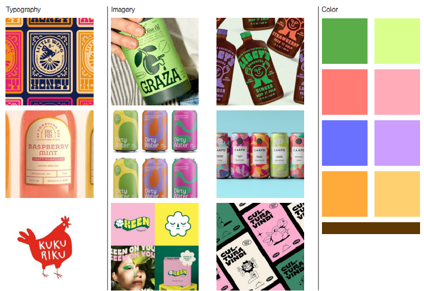
moodboard
The design direction was established through a moodboard exploring both modern and retro illustration styles, bold beverage packaging, and playful character-driven brands. The references pointed toward a 70s-inflected aesthetic — warm, energetic, and unapologetically fun.
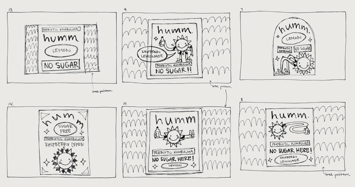
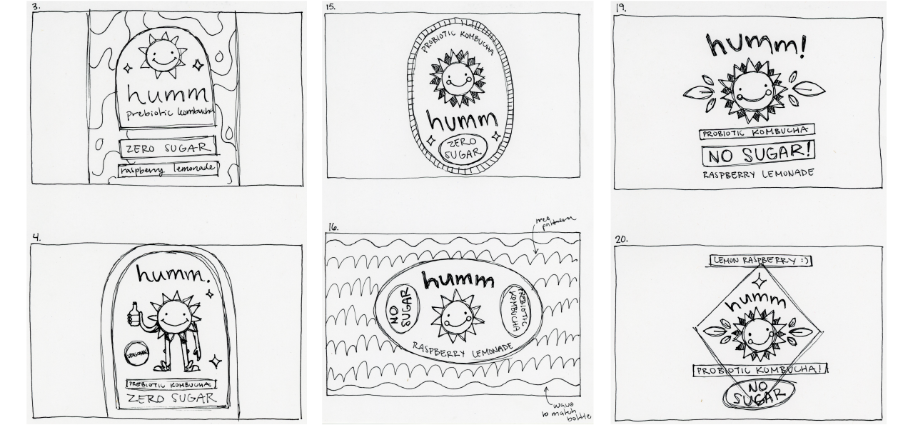
sketches
Colors
The palette is flavor-forward — each color directly evokes its drink. Pink for the tart brightness of Raspberry Lemonade, sage green for the fresh coolness of Coconut Lime, and periwinkle blue for the calm depth of Blueberry Mint. The shared black logotype ties all three together.
Typography
Grenadine was chosen for its bubbly letterforms that match the mascot's energy perfectly. It's whimsical without being childish — fun enough for a wellness brand that doesn't take itself too seriously.